Exprosoftech - Professional Business Website
Modern Business Website
A clean, professional website designed to showcase services and drive client engagement.
Transforming complex AI technology into clear value propositions—resulting in 3x demo requests and significantly improved visitor engagement.
SalesMonk had built something genuinely innovative—an AI platform that identifies anonymous website visitors, engages them through intelligent conversational agents, and books qualified sales meetings automatically. The technology worked. The problem? Their website didn’t.
When we first audited their digital presence, the data told a painful story:
The disconnect was clear: SalesMonk was spending money driving traffic to a website that failed to communicate their value. GTM leaders were landing on the page, seeing generic AI claims, and bouncing back to Google to find alternatives they could actually understand.
“We kept hearing the same feedback in sales calls,” the SalesMonk team told us. “Prospects would say ‘I visited your website but I still don’t really get what you do.’ That’s when we knew something had to change.”
Through competitor analysis and user research, we identified the core issues:
1. The “AI Buzzword” Problem Every sales tool claims to be “AI-powered” now. SalesMonk’s homepage led with technology instead of outcomes. Visitors couldn’t distinguish them from dozens of similar-sounding solutions.
2. Complex Product, Confusing Explanation Visitor de-anonymization, intent scoring, autonomous AI agents, calendar integration—SalesMonk does a lot. The old site tried to explain everything at once, overwhelming visitors instead of guiding them.
3. Missing Trust Signals Enterprise buyers need reassurance before booking demos. The site lacked social proof, compliance information, and credibility indicators where decision-makers looked for them.
4. Buried Value Proposition The core promise—turning anonymous website traffic into booked meetings—was hidden three scrolls down the page. Most visitors never saw it.
We approached this redesign with one guiding question: What does a VP of Sales need to see in 10 seconds to understand why SalesMonk matters?
We restructured the entire site around the buyer’s journey:
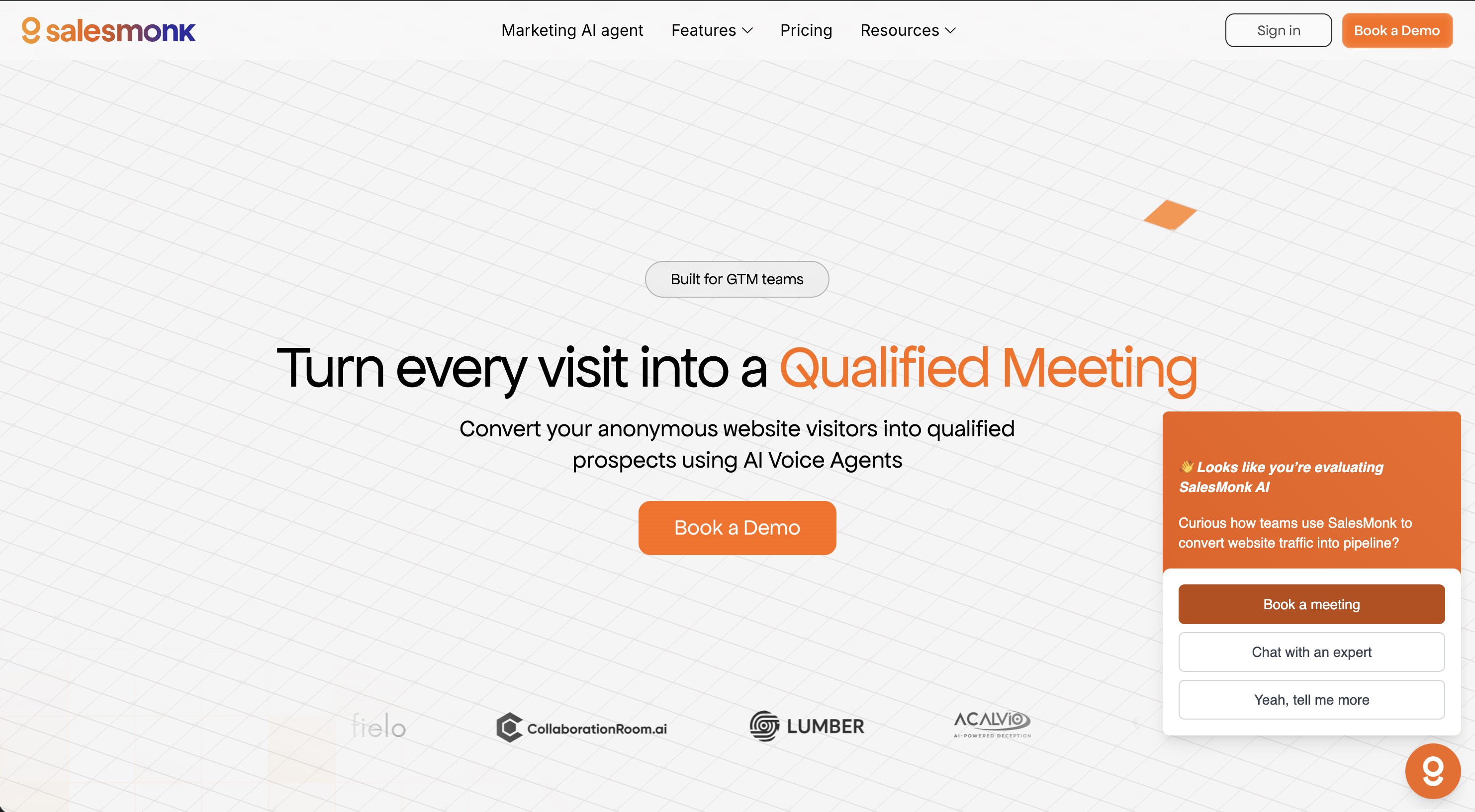
Above the Fold: One clear message—“Turn Anonymous Visitors into Qualified Meetings”—paired with a product screenshot showing the AI in action. No abstraction. No generic graphics. Immediate clarity.
Progressive Disclosure: Instead of overwhelming visitors with features, we created a narrative flow:
Feature Organization: We grouped capabilities into three digestible buckets:
The visual design needed to feel premium without being flashy. Our approach:
We mapped every CTA placement to user psychology:
Performance was non-negotiable. Enterprise buyers judge vendors on details.
Speed Optimization:
SEO Foundation:
Analytics Integration:
Within 90 days of launch, the transformed website delivered measurable impact:
| Metric | Before | After | Change |
|---|---|---|---|
| Demo Requests | Baseline | 3.2x increase | +220% |
| Bounce Rate | 87% | 54% | -38% |
| Avg. Session Duration | 38 seconds | 2 min 14 sec | +254% |
| Pages Per Session | 1.3 | 3.8 | +192% |
Beyond the numbers, qualitative feedback shifted dramatically:
“The new site actually explains what we do,” SalesMonk’s head of marketing noted. “Sales calls now start with ‘I saw on your website that you can…’ instead of ‘So what exactly do you guys do?’”
SalesMonk’s challenge isn’t unique. If you’re building complex technology and struggling to communicate its value, here’s what we learned:
Lead with outcomes, not features. Your prospects don’t care about your technology stack. They care about their problems getting solved.
Design for the 10-second test. If visitors can’t understand your core value proposition in 10 seconds, they’re gone.
Trust signals aren’t optional. Enterprise buyers need social proof and compliance information before they’ll consider a demo.
Performance is perception. A slow website suggests a slow company. Speed matters more than you think.
The SalesMonk website now functions as their most effective salesperson—working 24/7 to convert curious visitors into qualified pipeline. That’s what a strategic website redesign should deliver.
Ready to transform your website into a conversion engine? Let’s talk about your project →
Modern Business Website
A clean, professional website designed to showcase services and drive client engagement.
AI Finance Automation Platform Website
Building trust with risk-averse finance teams through strategic design—resulting in 189% more enterprise demo requests and shorter sales cycles.
SFA & Loyalty Platform Website Redesign
Positioning dual B2B products for enterprise buyers—resulting in 156% more qualified leads and a clear path to market leadership.
Business Transformation Consulting Website
Bridging consulting credibility with technology product positioning—resulting in 4x more qualified inquiries and a unified brand presence.